← All work Marketplace

Online shopping, built for Georgia

Role
UX/UI design
Platform
Web · Responsive
Market
Georgia
Languages
Georgian · English
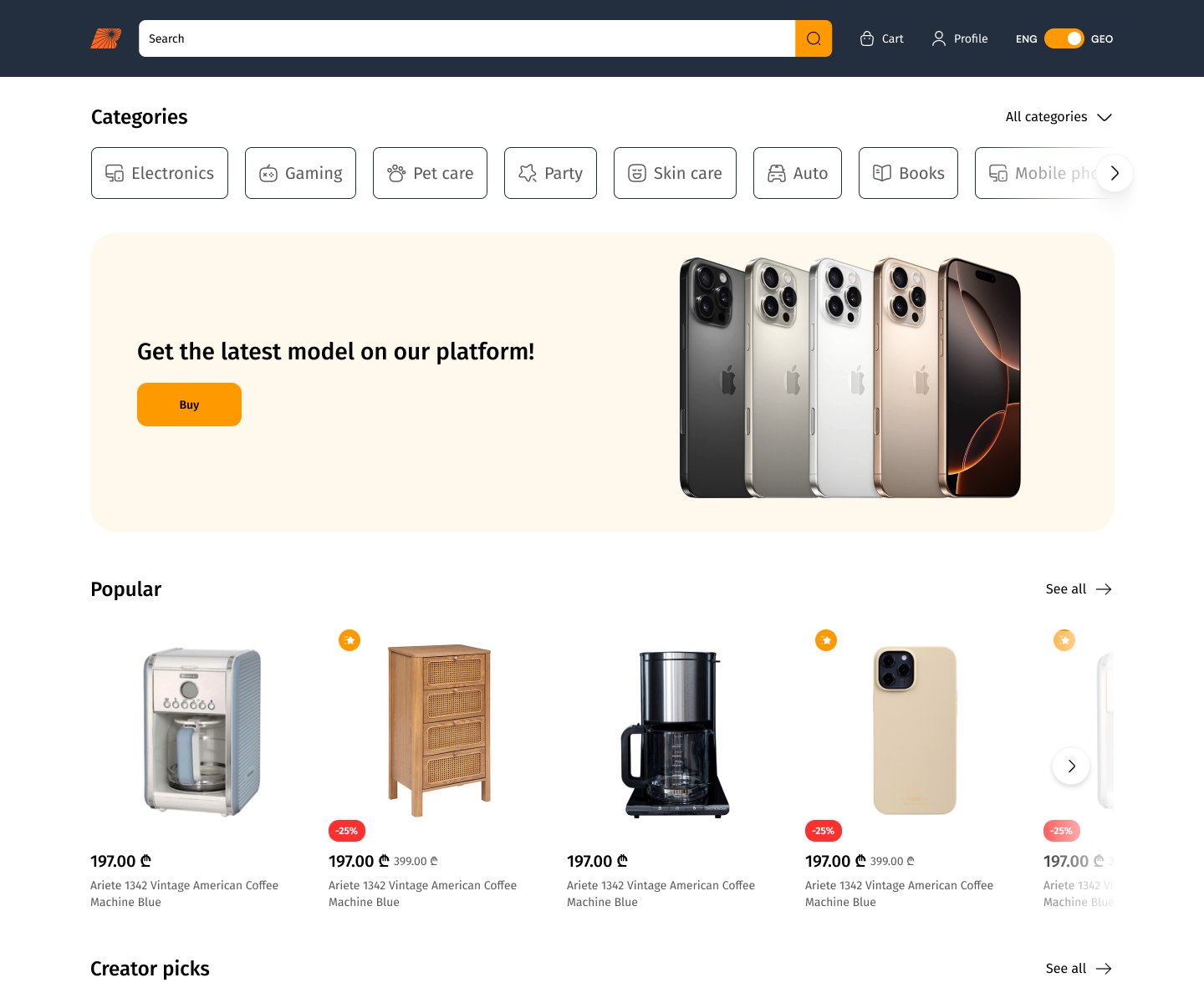
Marketplace homepage: search header, category chips, promo banner and popular products

Overview

Most local stores feel translated. This one was designed in Georgian from the very first frame, with English alongside.

The brief was a marketplace pitched as the largest online store in Georgia: products from 500+ shops across tech, gaming, pet care, skin care and auto, all in one cart. I designed the UX flows, UI and design system for shoppers across the country. The screens here are shown in English.

0+Screens and states designed
0Steps in the shopping journey
0Languages, one layout

Approach

Shoppers already know how online stores work, so the structure stays familiar and the details stay local.

  1. Designed for Georgian length

    Georgian words run long and have no capital letters to create hierarchy, so every component was tested with real Georgian copy before English.

  2. How Georgians pay

    Lari pricing with clear old and new prices, payment through local bank cards, and instalments right inside checkout.

  3. No dead ends

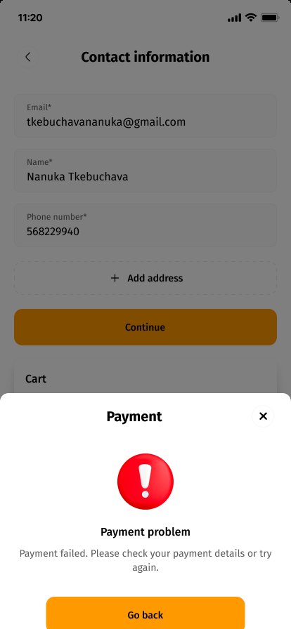
    Out-of-stock items, empty carts, invalid vouchers, form errors and failed payments all explain what happened and offer a next step.
Key Screens

Six moments from more than 170 desktop and mobile frames.

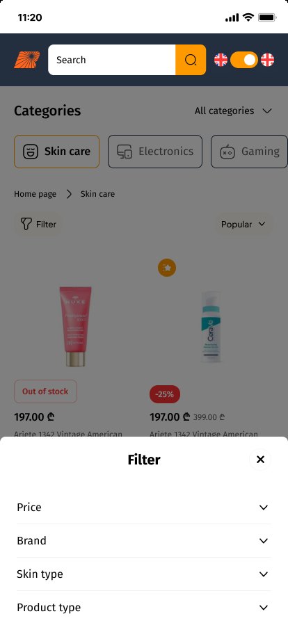
Category and filters

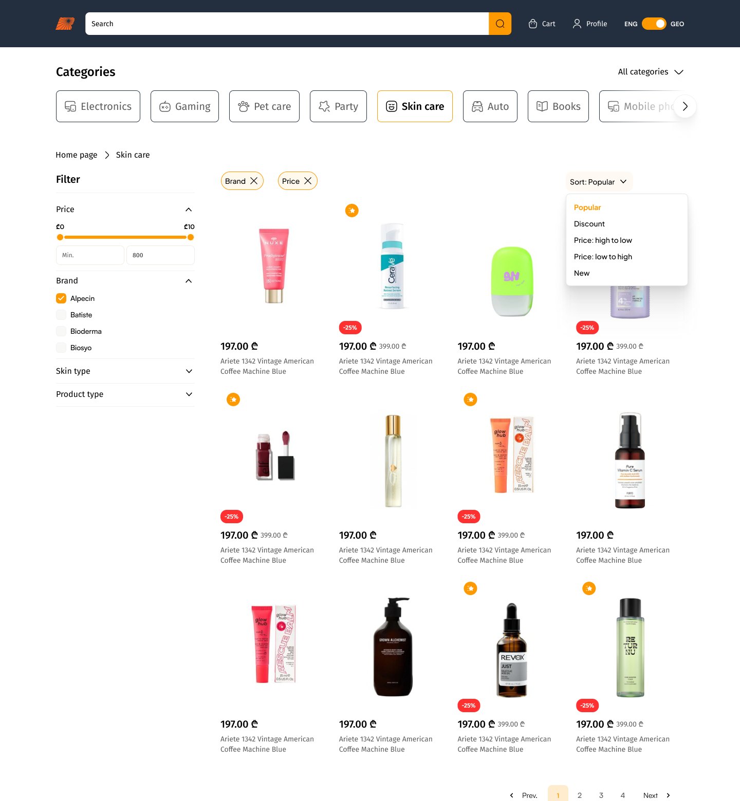
Category chips stay pinned under search; filters and sort sit beside the grid.

Skin care category with price filter, brands and sort
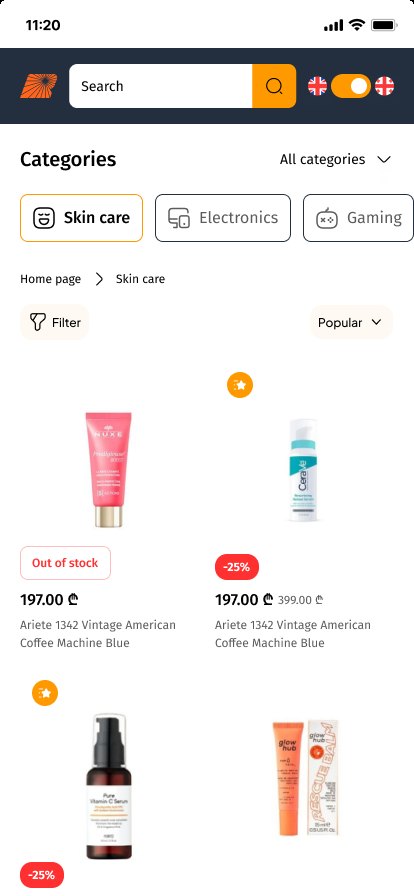
Category on mobile
Filter sheet on mobile

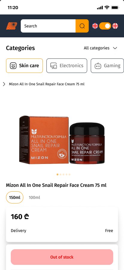
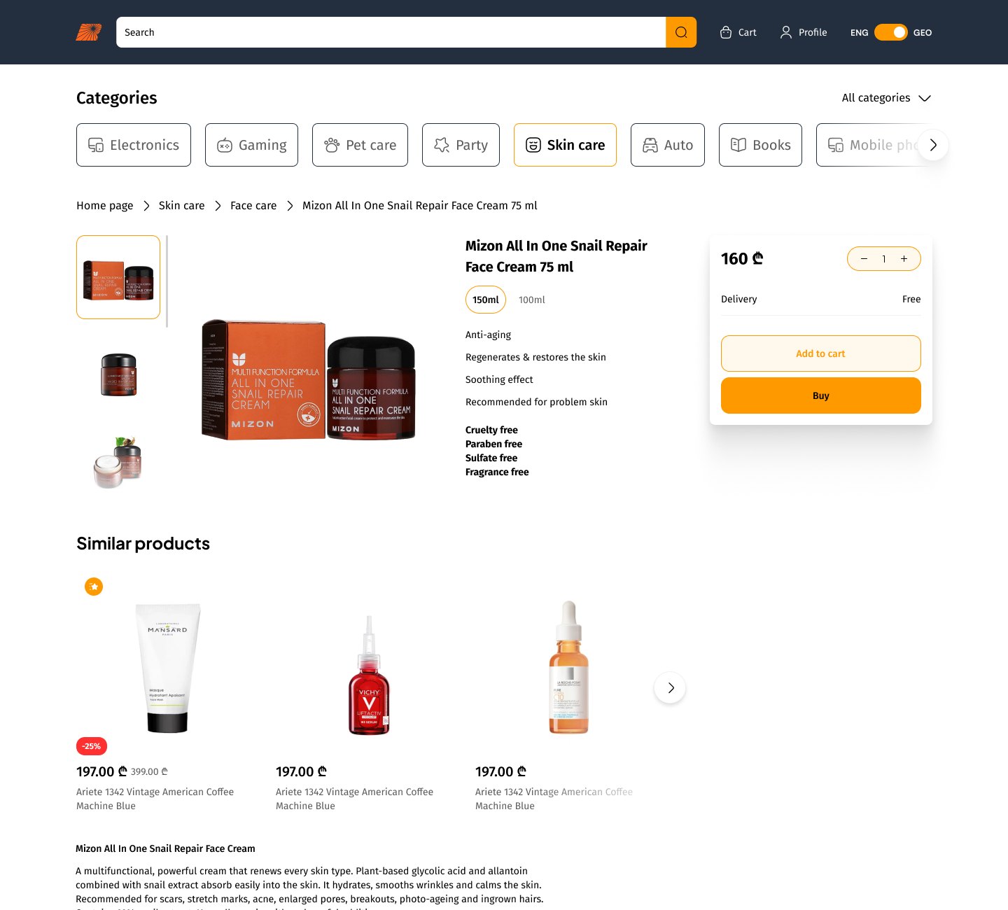
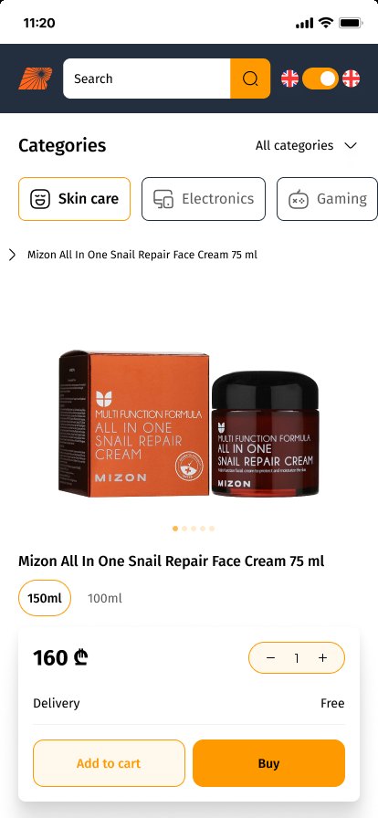
Product page

A gallery, size options and a buy box with quantity, add to cart and buy now.

Product page with buy box
Product page on mobile
Out of stock state on mobile

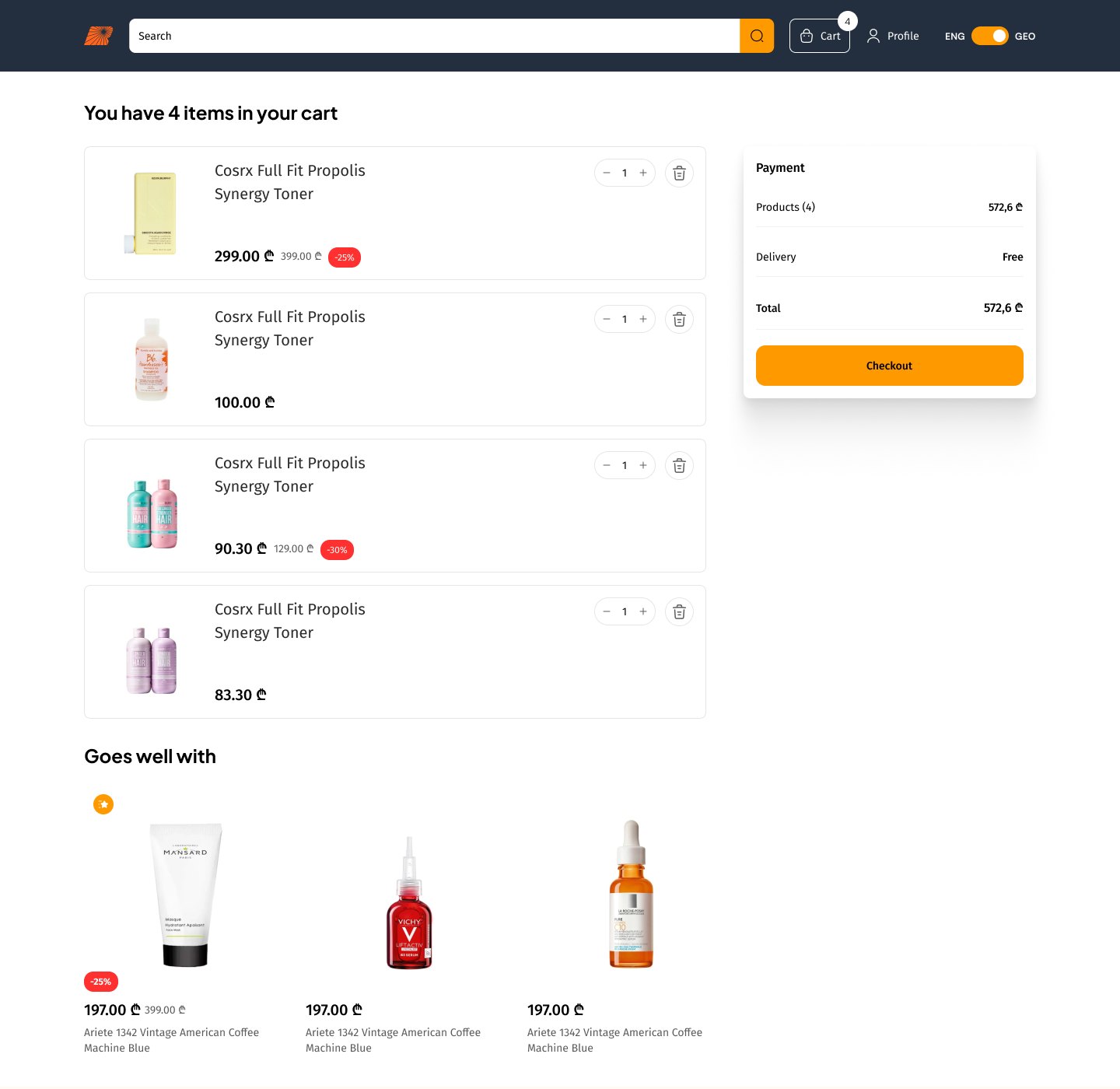
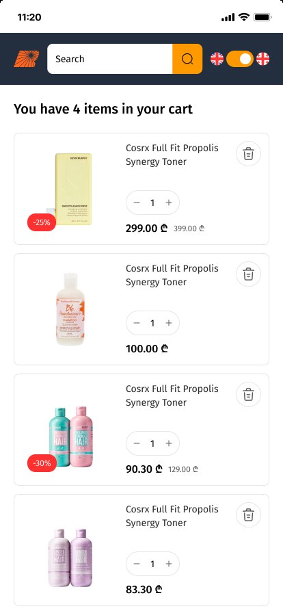
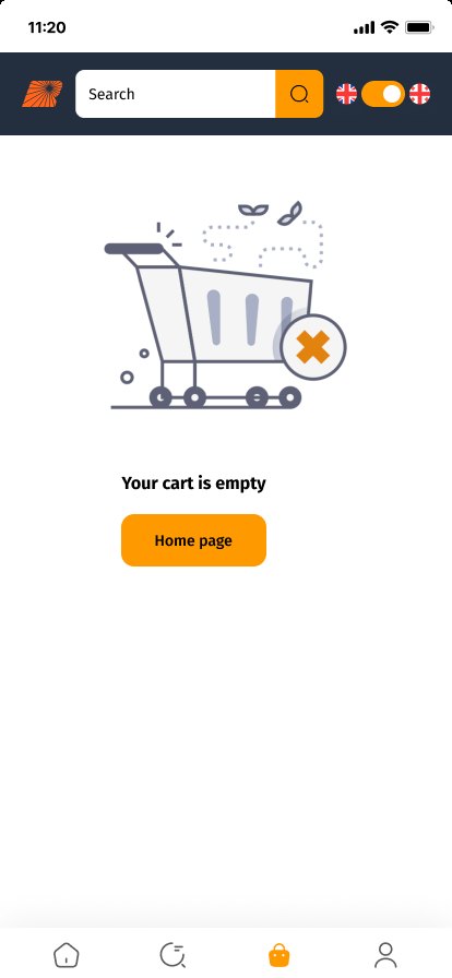
Cart, full and empty

Quantities change inline and savings stay visible; an empty cart points back to shopping.

Cart with four items and summary
Cart on mobile
Empty cart on mobile

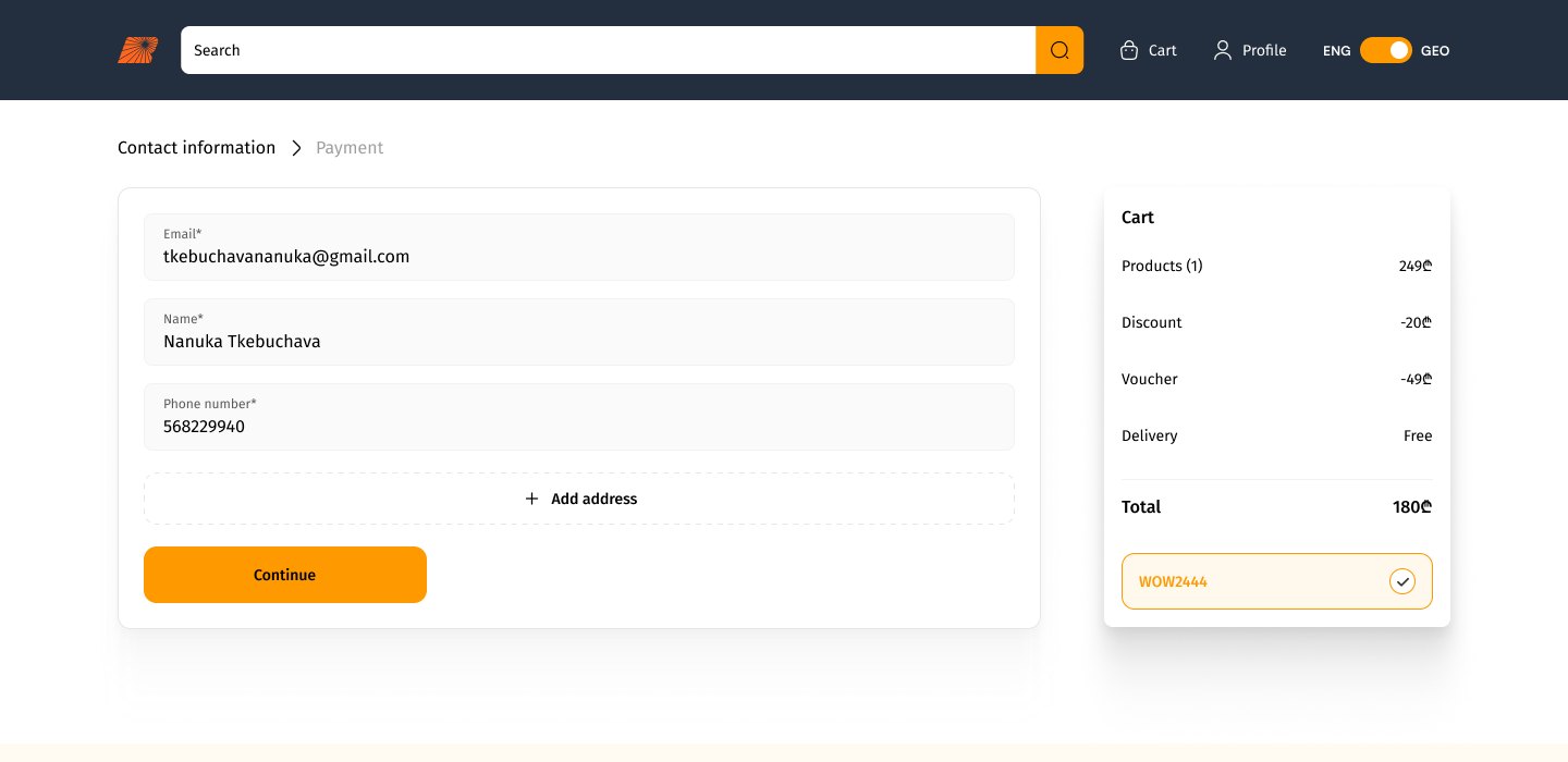
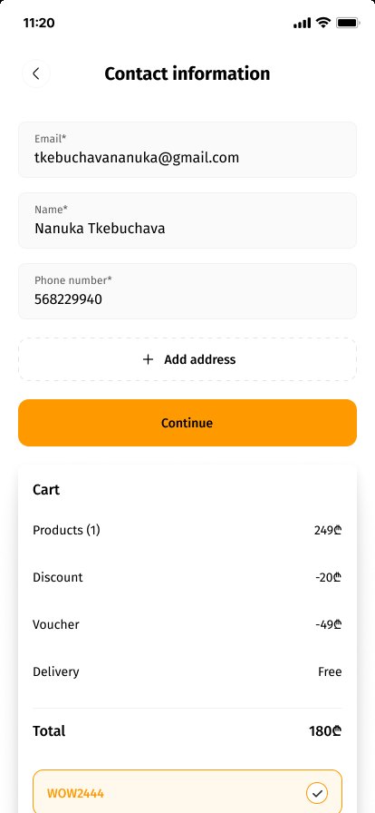
Checkout and voucher

Contact info, address and voucher sit on one page next to the summary.

Checkout with voucher applied
Voucher applied on mobile
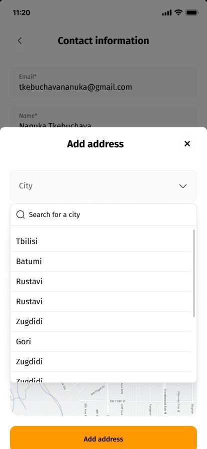
City search on mobile

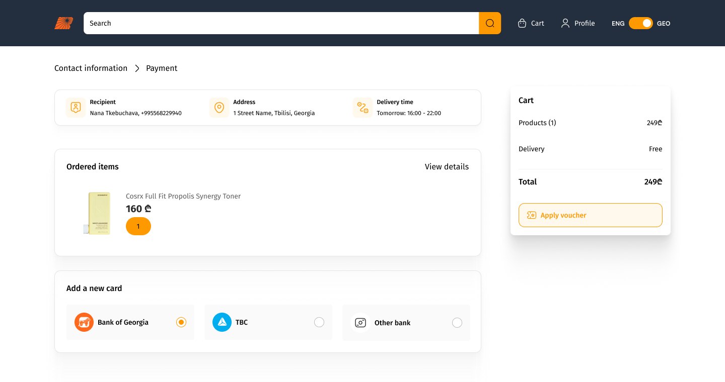
Payment, and when it fails

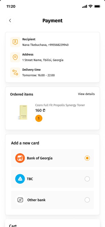
Delivery details on top, then Bank of Georgia, TBC or another card, with a clear way back if payment fails.

Payment step with bank options
Payment on mobile
Payment failed on mobile

Account and sign-up

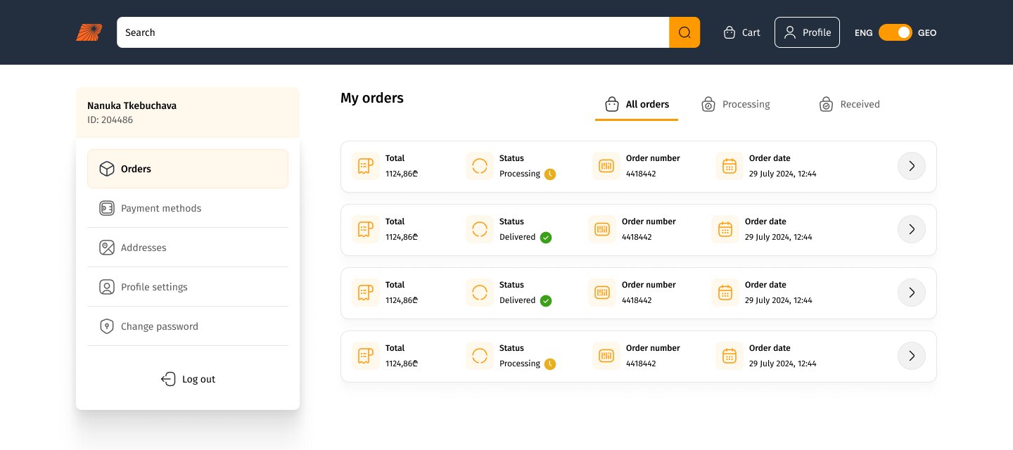
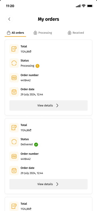
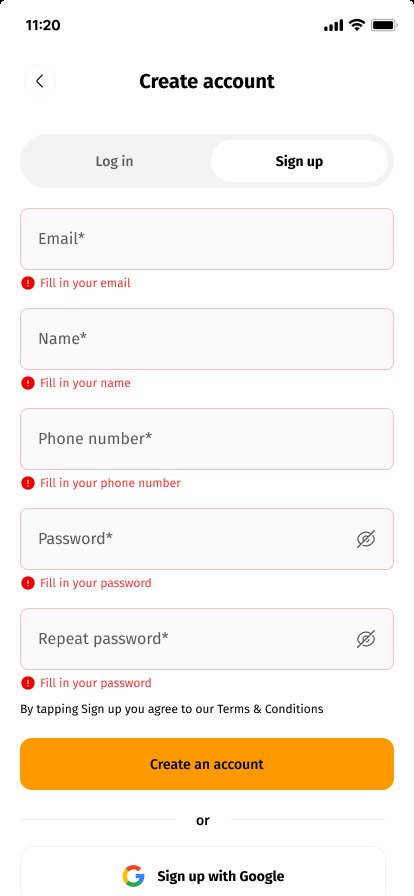
Orders with statuses, plus sign-up with inline errors and social login.

My orders with statuses
My orders on mobile
Sign-up errors on mobile

Try It

Pick a delivery time, choose how to pay, filter the shelf and apply a voucher.

Pick a delivery time
Pay your way

249 ₾ → 20.75 ₾ / month

Filter and sort the shelf
Max price
20 ₾120 ₾
Type
Apply a voucher · try WOW2024
Calming toner150 ml
1
49 ₾
Products (1)49 ₾
DeliveryFree
Voucher WOW2024-10 ₾
Total49 ₾
Pay

Reflection

Three lessons I'd take to the next store.

  • Real copy from day one

    Designing with actual Georgian text exposed truncation and wrapping issues that placeholder text would have hidden until development.

  • Unhappy paths are the product

    Out of stock, empty cart, wrong code, failed payment: the moments that lose customers got the same care as the happy path.

  • One colour for "go"

    Keeping orange only for forward actions made every next step easy to find in a dense, product-heavy layout.