Overview
Every promotion used to need a designer and a developer. Constructor lets the business launch it alone.
OnAim builds gamified promotions for businesses: leaderboards, raffles, progress bars, rewards and games. Constructor is the page builder behind them, used by marketing and CRM teams in Georgian, English, Russian and Turkish. I designed the UX flows, UI and states.
0Component blocks
0Languages per text field
0Lines of code to launch a page
Approach
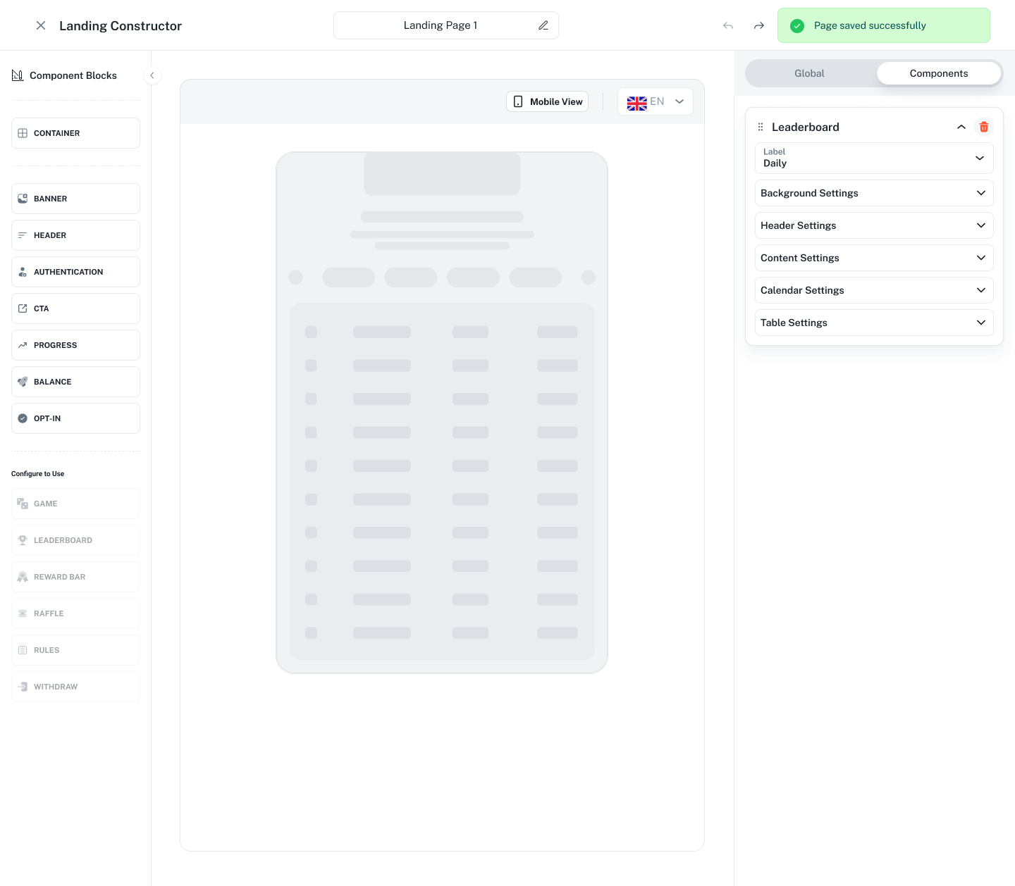
Three panels, one mental model: pick on the left, place in the middle, tune on the right.
Component library
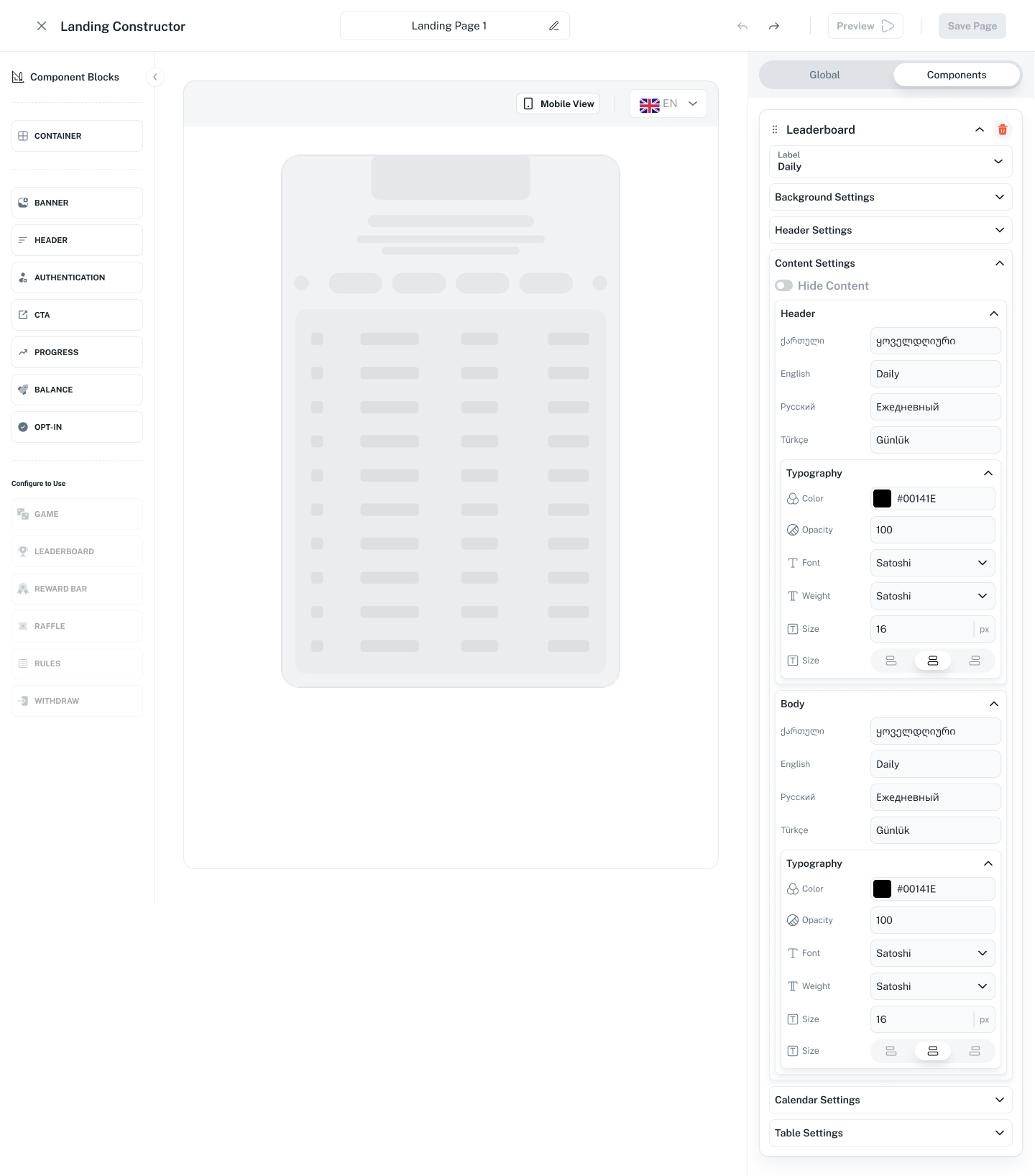
Ready-to-use blocks sit on top. Blocks that need setup first (Game, Leaderboard, Raffle) stay disabled until they're ready.
Live canvas
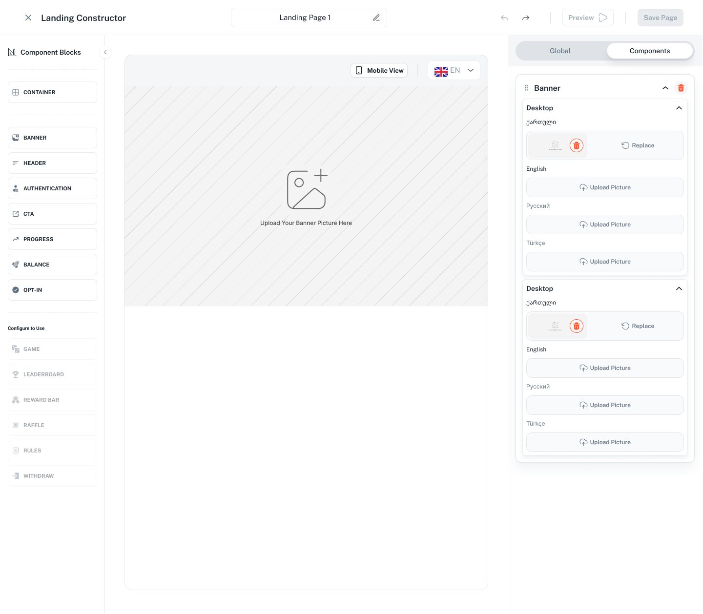
What you see is the real page, in mobile or desktop view and in every language.
Editing panel
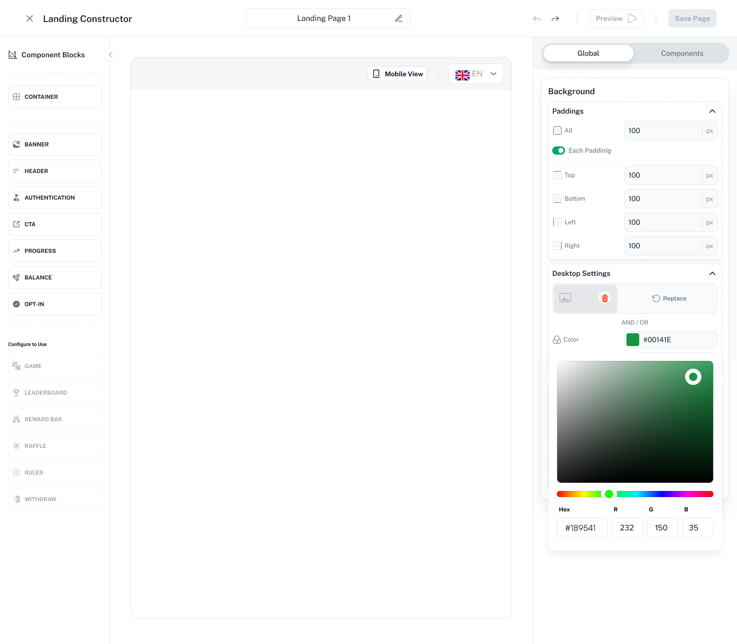
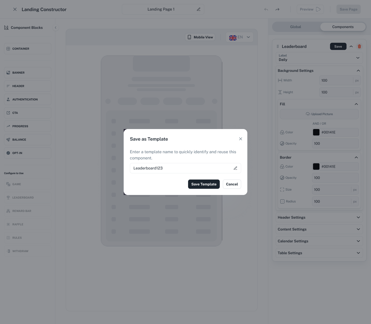
Global page settings or the selected component, with groups collapsed until needed.
Page controls
Inline page name, undo/redo, preview and save, each with clear disabled, hover, loading and done states.
Drag a block onto the page
Component blocks
BANNER
HEADER
CTA
PROGRESS
BALANCE
Configure to use
LEADERBOARD
RAFFLE
Drag blocks here
to start building
to start building
Customise in the editing panel
Join daily
GlobalComponents
Consistency is the feature
Every component's settings use the same rows (colour, opacity, font, weight, size, alignment).
Design for the fourth language
Georgian, Russian and Turkish strings run long.
Neutral tool, loud output
A quiet grey interface with a single green action colour lets the colourful promotion on the canvas take centre stage.